
Availability
Understanding why a metric moved — and where it's heading — is what turns data into decisions. Metric Insights gives you a dedicated space to do exactly that. From a single page, you can analyze performance trends, compare values across periods, break down data by dimension, add context with annotations, and jump directly into forecasts — so you can act on what you find without switching tools or losing your train of thought.
Navigate to Metrics > Metric Insights.
You can also open Metric Insights for a specific metric from the My Metrics, Metric Library, or Custom Metrics pages by opening the metric's drop-down menu and selecting View or View Metric Insights.
Use the metric selector at the top of the page to choose which metric to explore. Click the metric name to open the metric picker, where you can:
- Search by name using the search bar.
- Filter by Data source to narrow the list to a specific integration.
- Filter by Metric type — All, Favorite, Popular, Basic, Built, or Calculated.
- Filter by Tags to find metrics you've tagged.
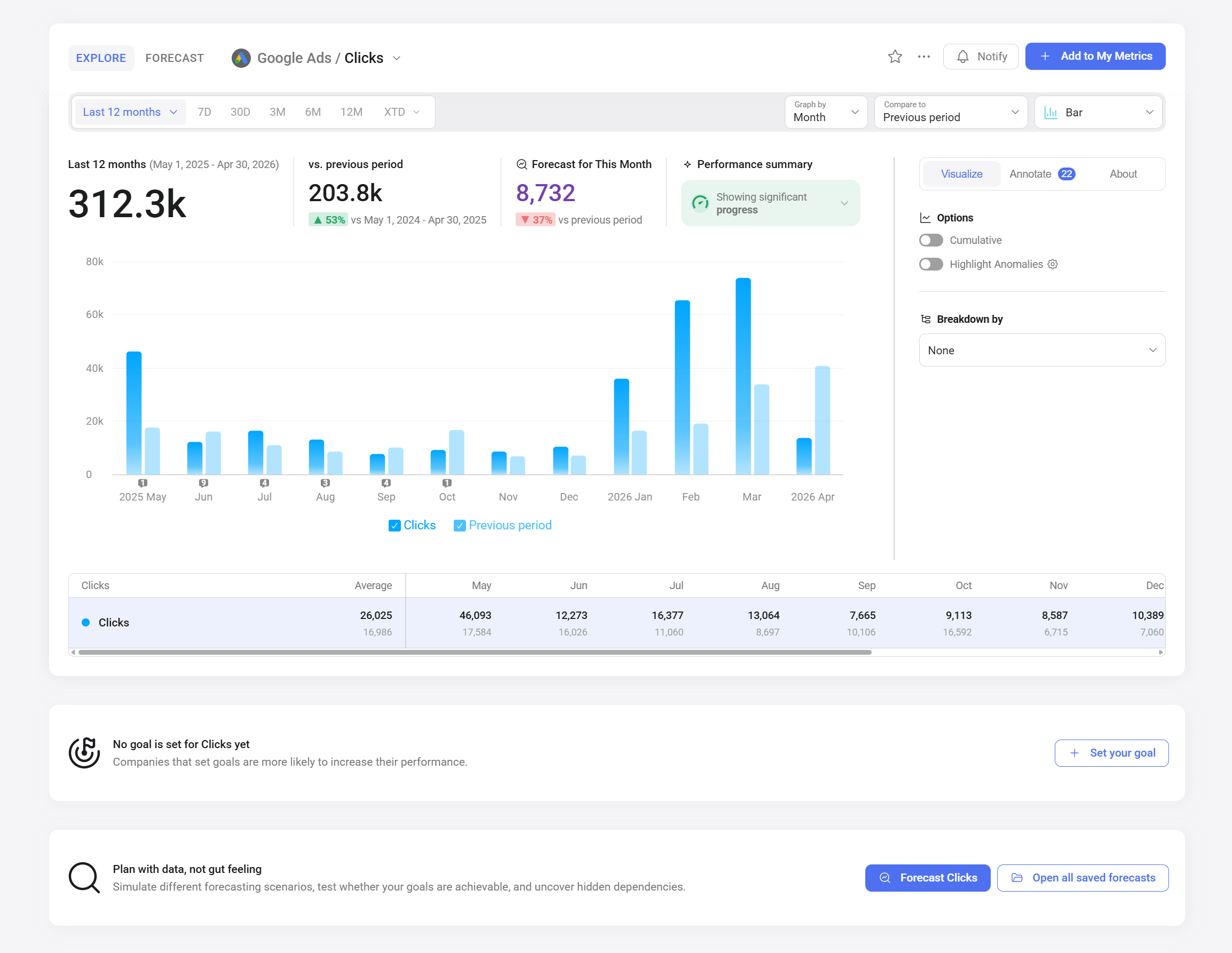
Use the controls at the top of the chart to define what data is displayed:
- Date range: Click the currently selected date range to open the date picker. You can choose from grouped presets or a custom range.
- Graph by: Select a granularity (day, week, month, etc.) to control how data is grouped on the chart. Available options depend on the data source's API.
- Cumulative: Toggle on in the right-hand panel to view a running total of the metric's values. This option may be disabled for certain metrics or date ranges to prevent inaccurate results — for example, when summing unique values would overcount the actual total.
Use the Compare to drop-down to overlay a secondary series on the chart and populate the vs. summary card above it. Available options include:
- None — removes any active comparison
- Previous period — overlays the prior equivalent period
- Same period... — compare to the same period in a previous year
- Custom range — define a specific date range to compare against
- Goal — compare current values against a goal set for this metric
- Other metric — overlay a different metric for side-by-side comparison
Click the chart type selector in the top right corner of the chart area to switch between available visualization types:
Toggle Highlight Anomalies in the Visualize tab of the right-hand panel to flag values that fall outside the expected range of variation for the selected metric. Anomaly detection uses historical data to define the expected range and marks deviations with color-coded indicators directly on the chart.
Use the Breakdown by drop-down in the Visualize tab to split the metric into categories based on a selected dimension. For example, you can break down Clicks by campaign or device type to compare how each segment contributes to the overall total.
Select None to remove the breakdown and return to the aggregated view.
Click the Annotate tab in the right-hand panel to view and manage chart annotations. Annotations are short text notes attached to specific points in time — useful for marking events like campaign launches, website outages, or product releases so you can correlate what happened with what changed in the data.
Click the About tab in the right-hand panel to view information about the selected metric, including:
- Data source name
- Metric name and description
- A More about this metric link with additional documentation from the Metric Library
The Performance summary card above the chart displays an AI-powered assessment of the metric's recent trend compared to the previous period. Click the card to expand a plain-language summary of key changes and trends in the data.
At the bottom of the expanded summary, an Ask Genie... input lets you ask follow-up questions about the metric directly. Genie will use the metric and its summary as context for its response.
If a goal has been set for the selected metric, the Goals section below the chart shows your current progress toward the target. Click Set your goal if no goal exists yet.

The Forecast for This Month card above the chart shows the projected end-of-period value based on historical data. To open the full Forecast Explorer for the selected metric, click Forecast [metric name] in the section below the chart. From there you can define model parameters, review the confidence score, and save the forecast.
To view all saved forecasts for this metric, click Open all saved forecasts.
FAQ
Why is the performance summary not showing?
Performance summaries require sufficient historical data for the selected date range and are not generated for custom metrics.
Why can't I see a forecast for my metric?
Forecasts require at least 12 months of historical data. If the metric has fewer than 12 months of data, or if forecasting is not included in your current plan, the Forecast option will not be available.


