
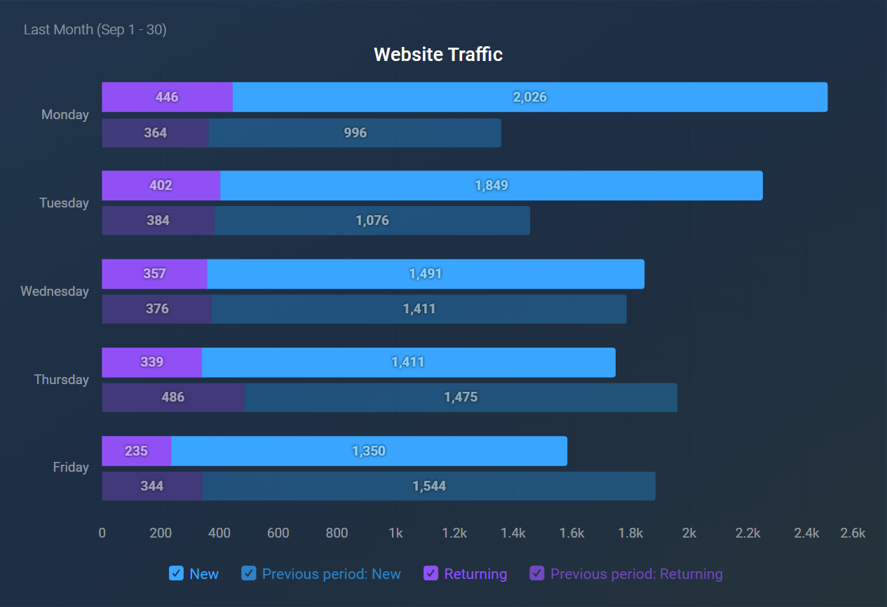
The Horizontal Bar visualization is particularly effective for making comparisons across different dimensions. It allows users to easily interpret and analyze differences in values, making it an ideal choice for visualizing performance metrics, survey results, or other categorical data.
The following key functionalities are offered by the Horizontal Bar visualization:
- A maximum of 15 metrics can be displayed at a time.
- Display of bar values can be toggled on or off according to your preferences.
- Comparisons are configured individually for each metric.
- Individual bars can be stacked for a more comprehensive view.
- The bars can be sorted based on their value, the name of the metric or dimension, or by manually rearranging the metrics in a custom order.
- The chart legend can be hidden to maximize the display area for the chart.
The Bar visualization is particularly useful in various scenarios, including:
- Sales Analysis: Compare sales figures across different regions or product lines to identify high and low performers.
- Customer Feedback: Visualize survey results across various questions to quickly assess customer satisfaction levels.
- User Engagement Analysis: Compare new versus returning users on a website to assess user retention and tailor marketing strategies for improved engagement.
- Budgeting: Compare expenses across various departments to ensure budget compliance and identify areas for cost savings.


