
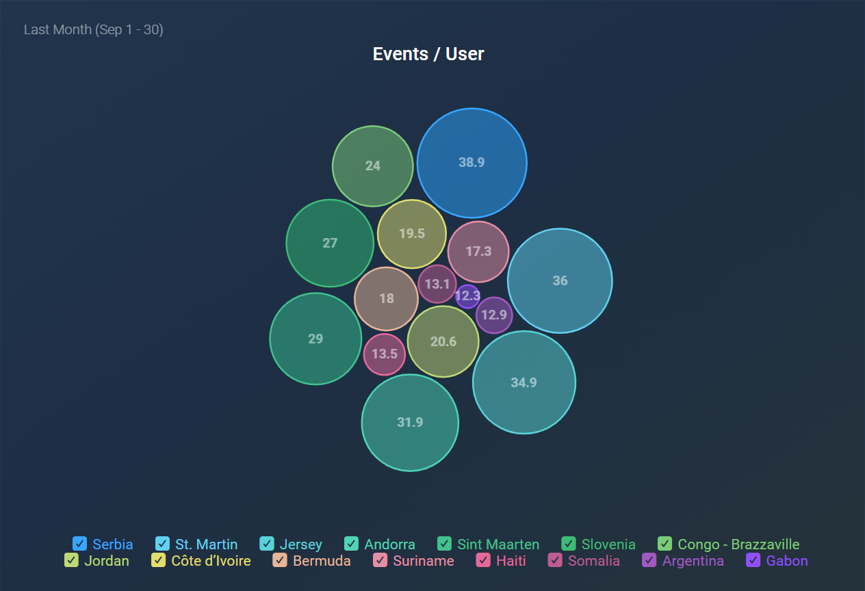
The Bubble visualization displays data as individual bubbles sized by value, allowing viewers to see relative magnitudes across multiple dimensions simultaneously. Each bubble represents a distinct metric or dimension category, enabling users to intuitively compare proportions and focus on key data segments.
The following features highlight the key functionalities of the Bubble visualization:
- Displays up to 15 metrics with 15 dimensions, for a total of 225 bubbles, plus an optional "Other" bubble to group additional values.
- Toggle values on or off to enhance visual clarity.
- Option to hide the chart legend to maximize display space.
- Comparison values and percentages appear only when hovering over bubbles.
The Bubble visualization is particularly useful in various scenarios, including:
- Market Analysis: Visualize market share across different product segments or competitors to identify growth opportunities.
- Project Management: Monitor project tasks by category, with bubble size indicating the resource hours needed for each task.
- Customer Support: Examine ticket stages like New, In Progress, and Resolved, with bubble size showing the volume or average handling time per stage.
- Sales Performance: Compare sales figures across regions or product lines, using bubble size to represent revenue or units sold.


