Databox allows you to structure your report content using a predefined set of elements, including text, images, and visualizations. This flexibility helps you organize information effectively, ensuring a clear and visually engaging presentation.
To add a new element:
- Move your cursor over the page or slide until plus (+) signs appear at anchor points.
- Click a plus (+) sign.
- Choose a reporting element from the dropdown menu.
Below is a complete list of available elements. Click on an icon to jump to the corresponding section of the article, where you'll find detailed descriptions, features, and key considerations.


This element visually represents a metric using one of the available visualization types. The visualization type can be changed anytime via the top-right corner control.
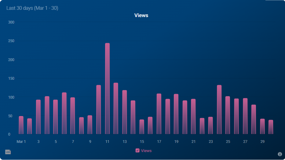
- Each metric is displayed as a separate block, with only one metric per block.
- The background color of the block cannot be altered.
The Databoard element lets you embed an existing Databoard into a single-page report or slide, providing a dynamic way to display multiple metrics and KPIs. It updates automatically with real-time data, ensuring the content reflects the most current performance insights and supporting informed decision-making.
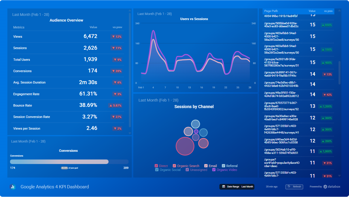
- Changes made to the source Databoard will be reflected in the single-report or slide.
- Date range selections on the embedded Databoard will not affect the default date ranges of the source Databoard.
- The Databoard cannot be edited directly within a single-page report or slide. However, by clicking Edit Databoard in the top left corner of a slide, you'll be taken to the Databoard designer, where you can make any necessary changes.
This element provides detailed insights into performance, along with personalized recommendations for improvement.
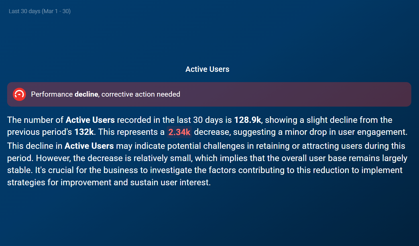
- AI Performance summaries have user- and account-based limits. More information available here.
- The background color of the block cannot be altered.
This element lets you embed placeholders (metric elements) within text, which are automatically populated with live data upon visualization or export, allowing you to craft a narrative around the numbers. This feature helps you tell a compelling story with performance metrics, ensuring that your analysis is not only engaging but also always up-to-date.
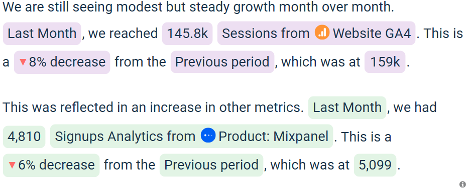
Supported metric elements include:
- Metric name and value
- Date range
- Comparison value, percentage change, and comparison period
- Each added metric or dimension is limited to a single comparison period.
- Custom text should remain neutral and adaptable, as values will fluctuate over time.
Headers serve as key markers for important content, such as section titles or navigation cues, enhancing organization and readability.

- Various formatting options are available, including font family, style and color customization and alignment.
Text elements allow for the addition of context, insights, and deeper analysis to support the presented data. They help bridge the gap between numbers and interpretation, making the information more meaningful.

- Text columns can also include Data Story elements.
- Various formatting options are available, including font customization, text alignment and indentation, bulleted and numbered lists, and hyperlink insertion.
Considerations
- If the text overflows the block and requires scrolling, it will still be fully visible in single-page report exports, with the block expanding to accommodate the entire text.
Images can be used to clarify complex concepts, enhance visual appeal, and make content more engaging. They serve as a powerful tool for reinforcing key points and supporting data-driven storytelling.

- Supported formats include JPG, PNG, and GIF, with a maximum file size of 10 MB.
- Images can be cropped to fit the desired layout.
- It's recommended to use images no larger than 1 MB to keep the exported document size manageable, as larger file sizes can cause issues when attaching the report to an email.
A structured layout for organizing data in rows and columns, allowing you to present multiple values, comparisons, or categories clearly and efficiently.
- Adjustable table width and height for flexible sizing.
- Customizable border width, style, and color.
- Control over cell spacing and padding for precise layout.
- Options to toggle caption, set alignment, and apply custom background colors.
- Advanced customization for individual cells.
- Support for diverse content types in each cell, including text, Data Story elements, dividers, and even nested tables.
A simple horizontal line used to separate content and improve visual structure within your presentation. Dividers help break up sections, emphasize transitions between elements, and enhance overall readability. Ideal for organizing dense layouts or creating a cleaner, more professional look.


