
By default, visualizations show comparison values in green when a metric increases and red when it decreases. For metrics where a lower value signals better performance — such as bounce rate, cost per click, or customer churn — this default is misleading. The favorable trend setting lets you flip the color logic per metric so your visualizations always reflect the correct performance signal.
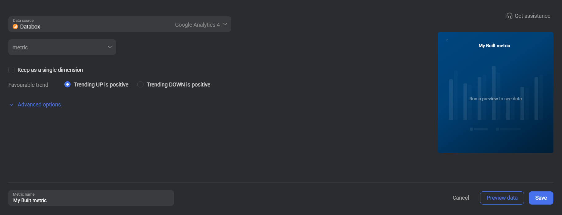
For custom metrics created from non-dataset sources, configure the favorable trend directly in the metric builder when creating or editing the metric.
- Go to Metrics > Custom Metrics.
- Find the metric and click Edit, or create a new custom metric.
- Under Favourable trend, select Trending UP is positive or Trending DOWN is positive.
- Click Save.
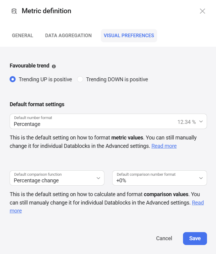
For custom metrics created with calculations or from dataset sources, configure the favorable trend through the metric definition settings.
- Go to Metrics > Custom Metrics and click Edit on the metric.
- Click Edit metric definition.
- In the Metric definition dialog, select the Visual Preferences tab.
- Under Favourable trend, select Trending UP is positive or Trending DOWN is positive.
- Click Save.
FAQ
Can I configure the favorable trend for a basic metric?
No. The favorable trend for basic metrics is pre-configured by Databox based on standard conventions and cannot be changed by users. If the default setting doesn't match your use case, you can create a custom metric using the same data source. If you believe the default is incorrectly set, contact Databox Support or your Customer Success Manager to have it reviewed and corrected.
Does changing the favorable trend affect all visualizations?
Yes. Favorable trend is a metric-level setting, so the change applies everywhere that custom metric is used across your account.


