
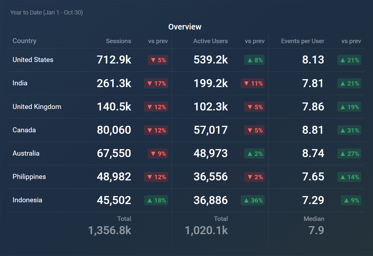
The Table visualization presents data in a structured grid layout, making it easy to view and compare individual data points across multiple metrics and dimensions. This format is particularly effective for displaying detailed information, allowing users to analyze performance, identify trends, and spot anomalies within their datasets. By organizing data into rows and columns, the Table visualization supports in-depth analysis and facilitates data-driven decision-making.
The following features highlight the key functionalities of the Table visualization:
- A maximum of 30 columns can be displayed, each representing different metrics, dimensions, or granularities.
- Each column can be customized with its own title, aggregation function (SUM, AVG, MED, MIN, MAX), and available comparison options.
- Each row corresponds to a metric (if it lacks dimensions) or a dimension (for metrics that include dimensions).
- The table can be sorted based on a specific column's value, the name of the metric or dimension, change value, or by manually rearranging the metrics in a custom order.
- Row numbering can be toggled on or off as needed.
- Up to 100 rows can be displayed, with the option to include an additional "Other" row to group any remaining values.
- All columns, except for the first, are required to display numerical data.
The Table visualization is particularly useful in various scenarios, including:
- Performance Reviews: Display employee performance metrics across various departments, enabling managers to identify high performers and areas for improvement.
- Sales Reporting: Present detailed sales data across different regions or products, allowing teams to analyze performance and adjust strategies accordingly.
- Inventory Management: Show inventory levels for different products along with relevant metrics, helping businesses manage stock and make informed purchasing decisions.
- Financial Analysis: Organize financial data, such as revenues and expenses, for various departments, aiding in budget analysis and forecasting.


