
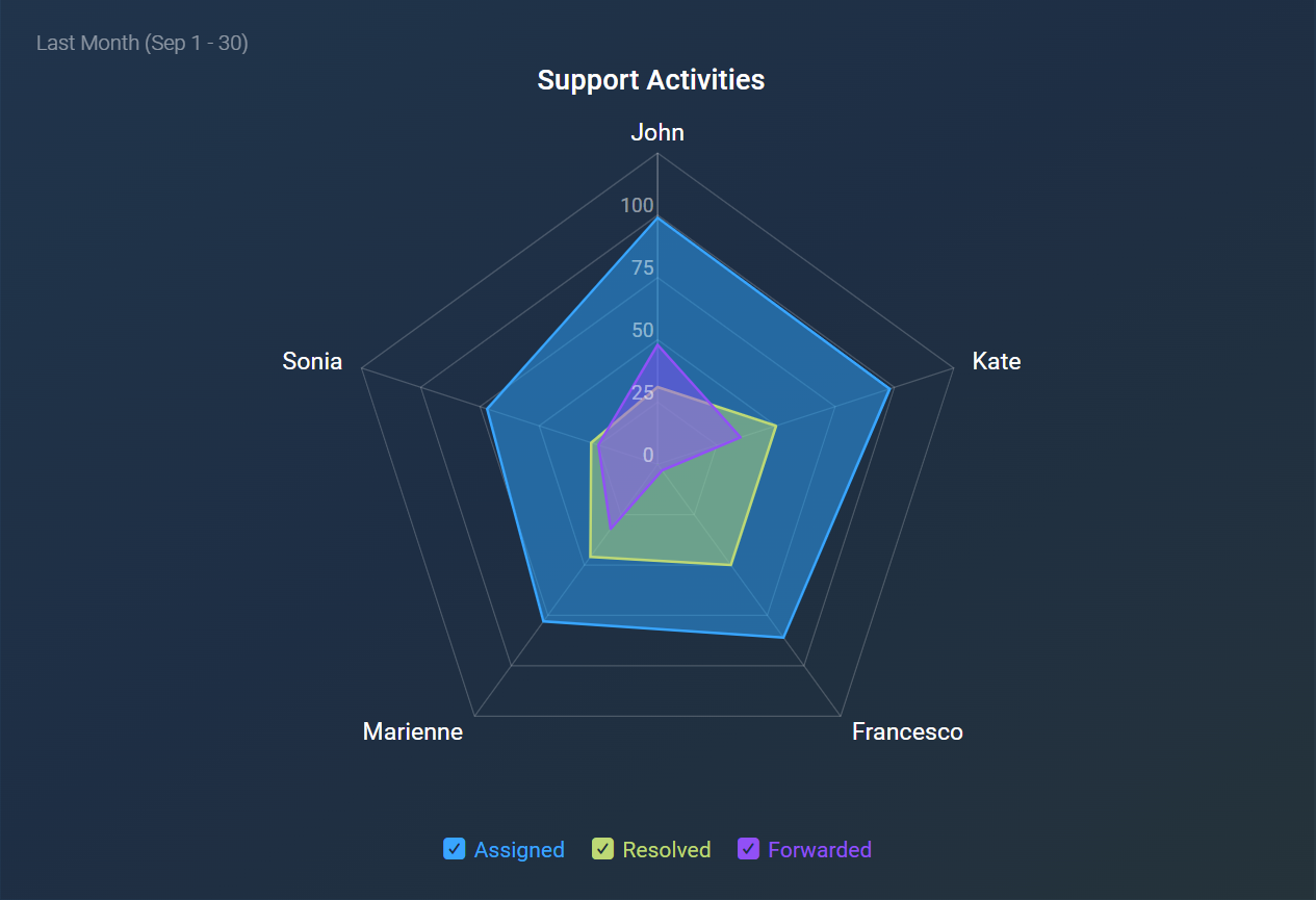
The Spider visualization, also known as a radar chart, enables easy comparison of multiple dimensions across a single metric, with axes extending for each dimension or category. This visual is particularly suited for spotting outliers, evaluating performance across varied categories, and comparing multiple factors within one visualization.
The following features highlight the key functionalities of the Spider visualization:
- Displays up to 15 metrics with 15 dimensions, allowing for a maximum of 225 edges, plus an optional "Other" edge to group additional values.
- Edges are ordered by the highest value of the first metric in chronological order.
- Values can be toggled on or off for enhanced clarity.
- The chart legend can be hidden to maximize display space.
- Comparison values and percentages are displayed only when hovering over the lines.
The Spider visualization is particularly useful in various scenarios, including:
- Performance Benchmarking: Visualize team performance metrics across multiple categories for clearer insights into strengths and weaknesses.
- Customer Segmentation Analysis: Compare attributes of different customer segments (age, spending, region) to inform targeted strategies.
- Product Comparison: Compare product features or attributes to understand which products perform well on key metrics.
- Support Ticket Analysis: Compare ticket stages—Open, In Progress, Escalated, Resolved—across metrics like count or average time to spot resolution delays.


