
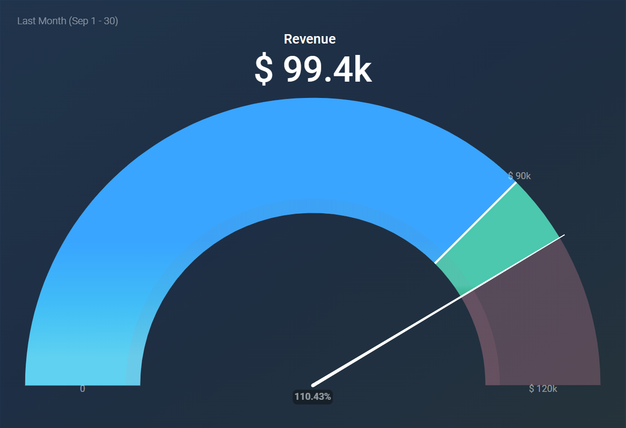
A Gauge visualization displays a single metric value with a pointer, resembling a speedometer, to provide a clear view of performance against a defined target or range. This visualization is particularly effective in highlighting how close a metric is to its goal, allowing users to quickly assess performance at a glance.
The following key functionalities are offered by the Gauge visualization:
- If a goal value exists, a white line will be drawn to indicate it for the selected metric or dimension.
- The maximum value can be set to calculate automatically or be aligned to a metric or custom value.
- The total figure above the chart can be toggled on or off based on your preference.
- Traffic light coloring is available to visually indicate progress toward a target or maximum.
- The color gradient is determined by the selected color theme.
- Comparisons against other periods are not supported in this visualization.
- This visualization displays data for only one metric or dimension at a time.
Here are some ideal applications for the Gauge visualization:
- Sales Performance Tracking: Monitor sales performance against targets to motivate and assess progress.
- Project Completion Monitoring: Keep track of project completion percentages against set milestones for efficient management.
- Campaign Success Evaluation: Measure the effectiveness of marketing campaigns by comparing key metrics against predetermined goals.
- Service Level Assessment: Evaluate service levels against targets for response times or customer satisfaction metrics.


