
IN THIS ARTICLE
What is a Benchmark Group?
A Benchmark Group is a group of companies, defined by the cohort characteristics, such as company size, yearly revenue, type of business or industry and the set of selected metrics from different sources.
Two groups with the same cohort characteristics might differ by the metrics selected for the groups, based on which benchmarks are being calculated.What is a Benchmark?
A Benchmark is a set of statistics calculated for a given metric in a benchmark group.
Learn more how to access and view Benchmarks here.
How are Benchmarks Calculated?
IN THIS SECTION
We calculate benchmarks from anonymized data of Databox users. For private groups, we calculate the benchmark from data of invited and contributing members who match group characteristics.
Benchmarks are being calculated for the last month from data of all the participating contributors matching the group, which is defined by selecting size, sector, revenue and type of business, or any of their combinations. For example, the group below is defined by the Industry “Marketing & Advertising”, and the Company Size between 11 and 50 employees.
Benchmark Visualizations

The benchmarks visualizations consist of several statistics, presented on a Bar Line and a Hill Chart:
- A) Median: 50% of all values are smaller than the median.
- B) 1st quartile: 25% of all values are smaller than the 1st quartile.
- C) 3rd quartile : 75% of all values are smaller than the 3rd quartile.
- D & E) Lower Bound and Upper Bound: Some values differ significantly from other values in the group. We define such values as outliers in statistics. The outliers are identified for each graph and are removed from the visualization, since such values can distort the visualizations and reduce their usefulness and interpretability. The lower and upper bounds are the outlier bounds.
Bar Line

The Bar Line is a simple visualization that only shows the main statistics: lower bound (start of smaller bar), 1st quartile (start of larger bar), median, 3rd quartile (end of larger bar), and the upper bound (end of smaller bar). These statistics provide a rough estimate of the data’s distribution.
Users can quickly see how their company compares to other similar companies, and how close they are to be in the top 50% or 75%.
Hill Chart

The Hill Chart visualization shows the main statistics: lower bound (start of the lighter colored area), 1st quartile (start of darker colored area), median, 3rd quartile (end of darker colored area), and the upper bound (end of the lighter colored area). These statistics provide a rough estimate of the data’s distribution.
The bounds of the graph are the same as in the Bar Line, but the additional benefit of the Hill Chart visualization is that it is higher in areas with more data and lower in areas with fewer data.
Mathematical calculations in Benchmarks
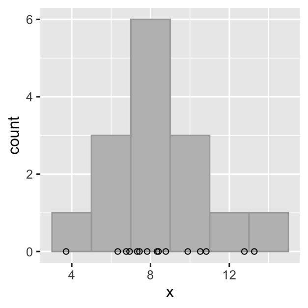
Let's explain the mathematical calculations in Benchmarks with a histogram.
On this visualization, we can see that data is being distributed into equally-spaced bins and the number of values in each bin is being counted. Next, the bars are drawn for each bin, where the height of the bar is proportional to the number of values in each bin. See a histogram on the image below as an example.
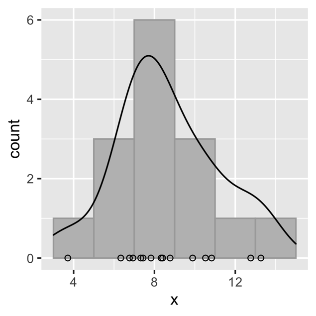
The black line represents the Hill Chart for the same underlying values as the histogram’s. The height of the Hill Chart shows us where the most of the values are. The higher the hill, the more values we can find in that area (the values are the metric values from our contributors).
Your value in a Benchmark
Your value is shown on the graph with a vertical line. This makes it easy for you to compare with the rest of the group, and quickly identify the metrics where you are one of the leaders and metrics where you can improve your company's performance.

If your value is a statistical outlier, it will not fall within the bounds of the graph. In that case, your value will be shown on either the left border (if the value is significantly lower than other values) or the right border (if the value is significantly higher than other values).
For each company, we also calculate the outrank ratio. This value represents the percentage of companies your company outrank in your group. For example, an outrank ratio of 0.7 shows that the company’s value is higher than 70% of other companies’ values in the group in case a higher metric value is positive (like Website Sessions), or lower than 70% of other companies' values in case a lower metric value is negative (like Churn). The outrank ratio is outlined below the graph.
