
After aligning your team around the appropriate KPIs to include in your reports, the next major piece to consider as you're building out your Databoards is which Visualization Type will work best for each Metric.
For every Metric, there are multiple Visualization Types that could work, but you have to consider what the intent is behind this Metric being added to the Databoard and what visualization will ultimately tell the intended story with the data. Below we work through some common "this or that" scenarios you may be in while building your dashboards.
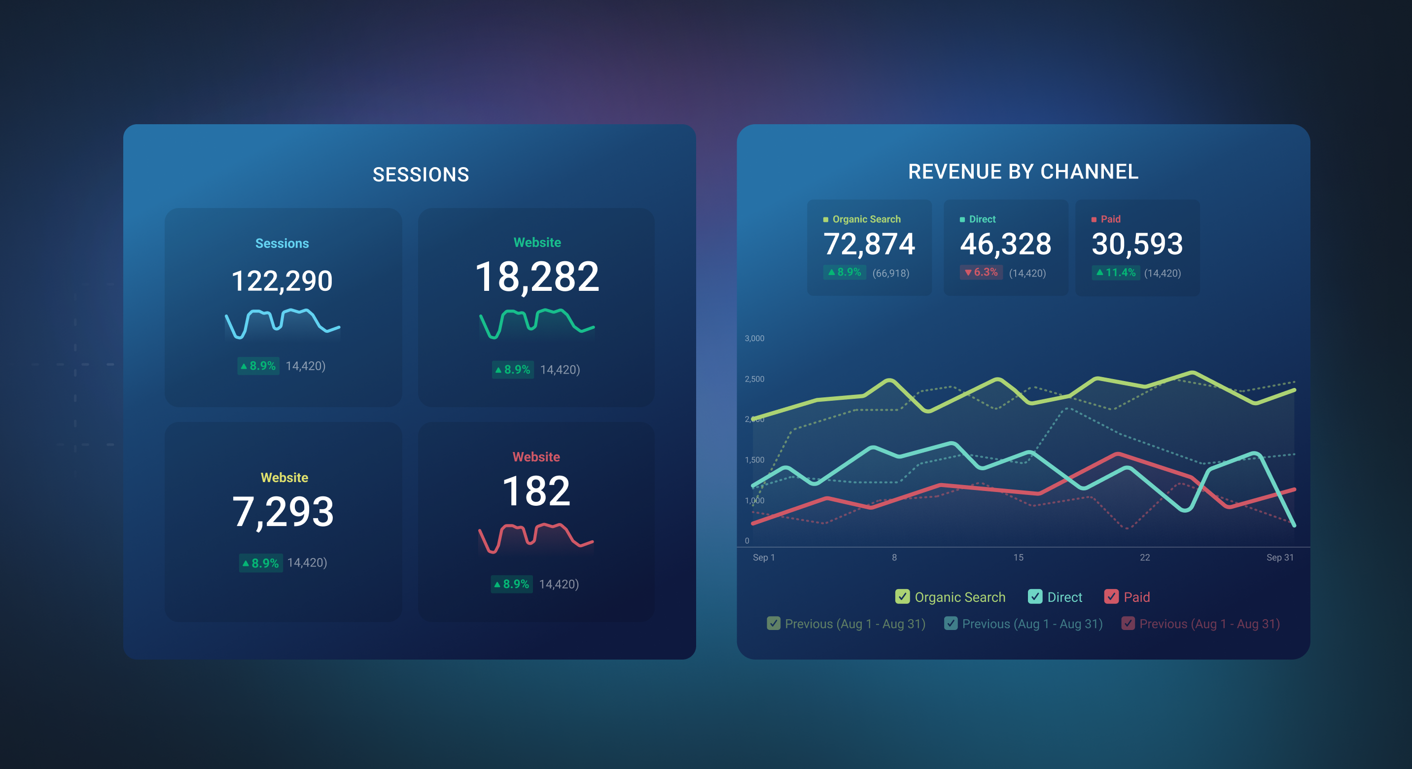
A Number Block is designed to display an aggregate for the selected data range. On the other hand Line/Bar Charts shows series of data for the selected date range. The Number visualization is compact, clear and precise. Line/ Bar Charts are better used to highlight growth over time or patterns in your data.
You should aim to have at least one Number block and at least one Line/ Bar Chart per Databoard to allow for both basic and advanced analysis.
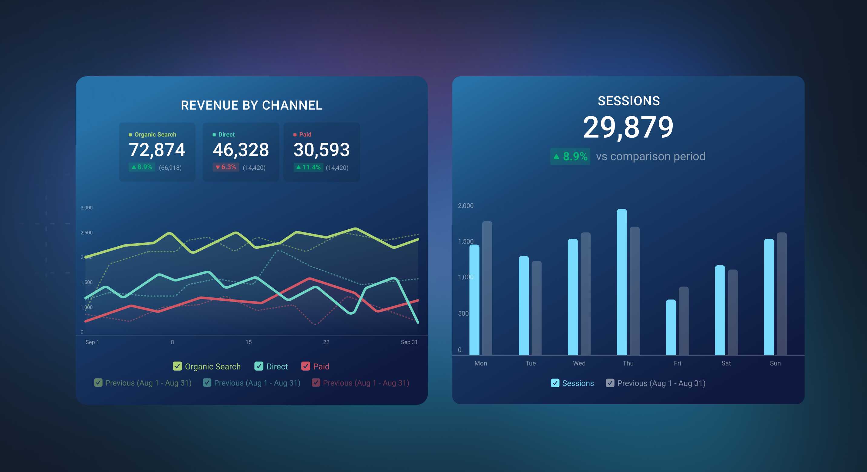
Line Charts are great when you want to visualize patterns over a longer period of time and compare data to a previous period. The Line Chart visualization is familiar to most people and can, therefore, be easily interpreted.
Bar Charts are similar to Line Charts, but they really prove valuable when you want to compare different Dimensions to each other as you can compare the sizes and the distribution between them.
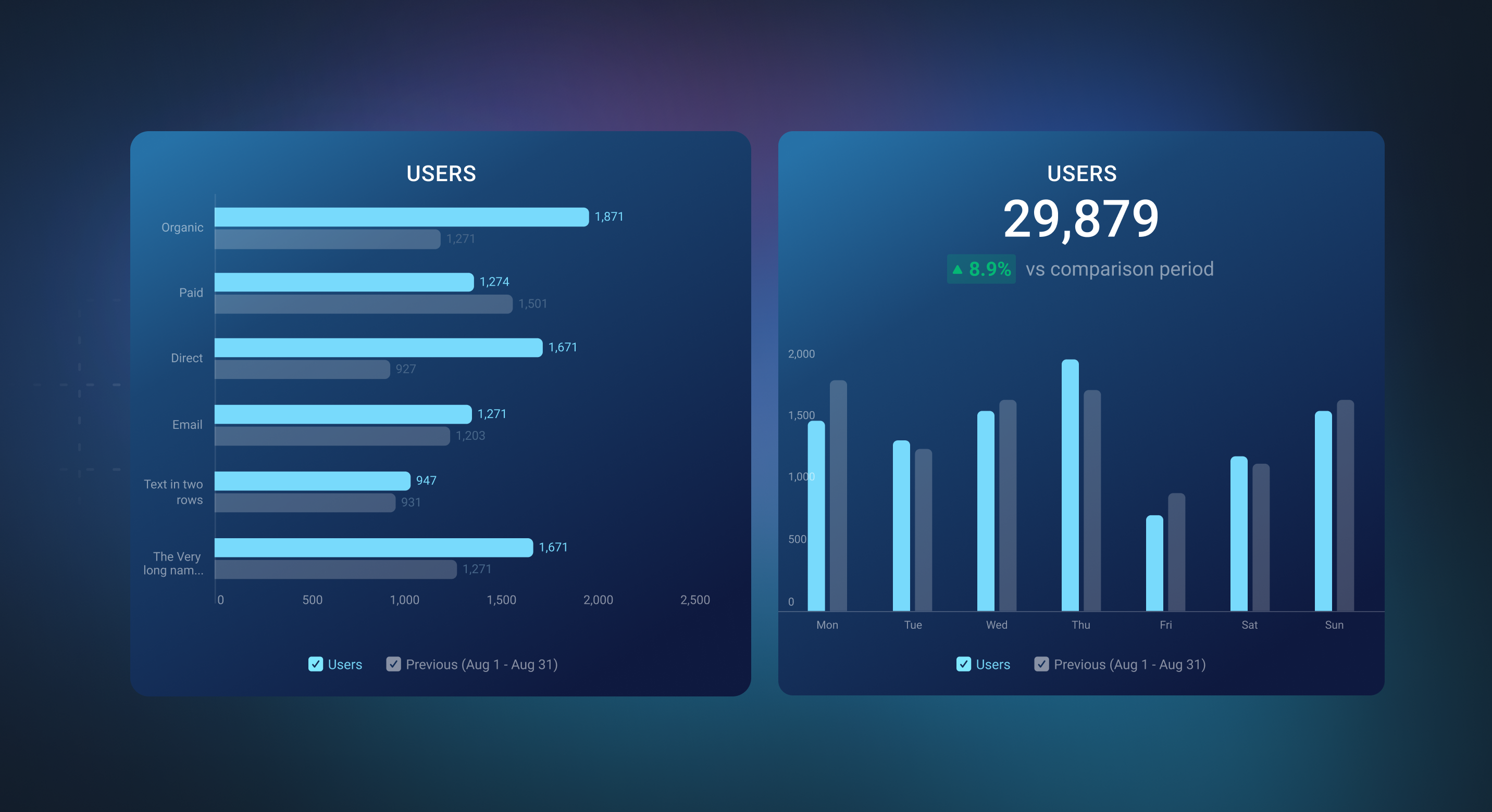
Horizontal Bar Charts display data using horizontal bars, where the length of each bar represents the value of a particular metric or dimension. These charts are particularly useful when you want to compare data across different dimensions, and they provide ample space for long category labels along the vertical axis.
Vertical Bar Charts, on the other hand, use vertical bars to represent data values. Like horizontal bar charts, they are effective for comparing data across dimensions. Vertical Bar Charts are often preferred when you have limited horizontal space and need to accommodate a large number of dimensions or when you want to emphasize the vertical aspect of your data.
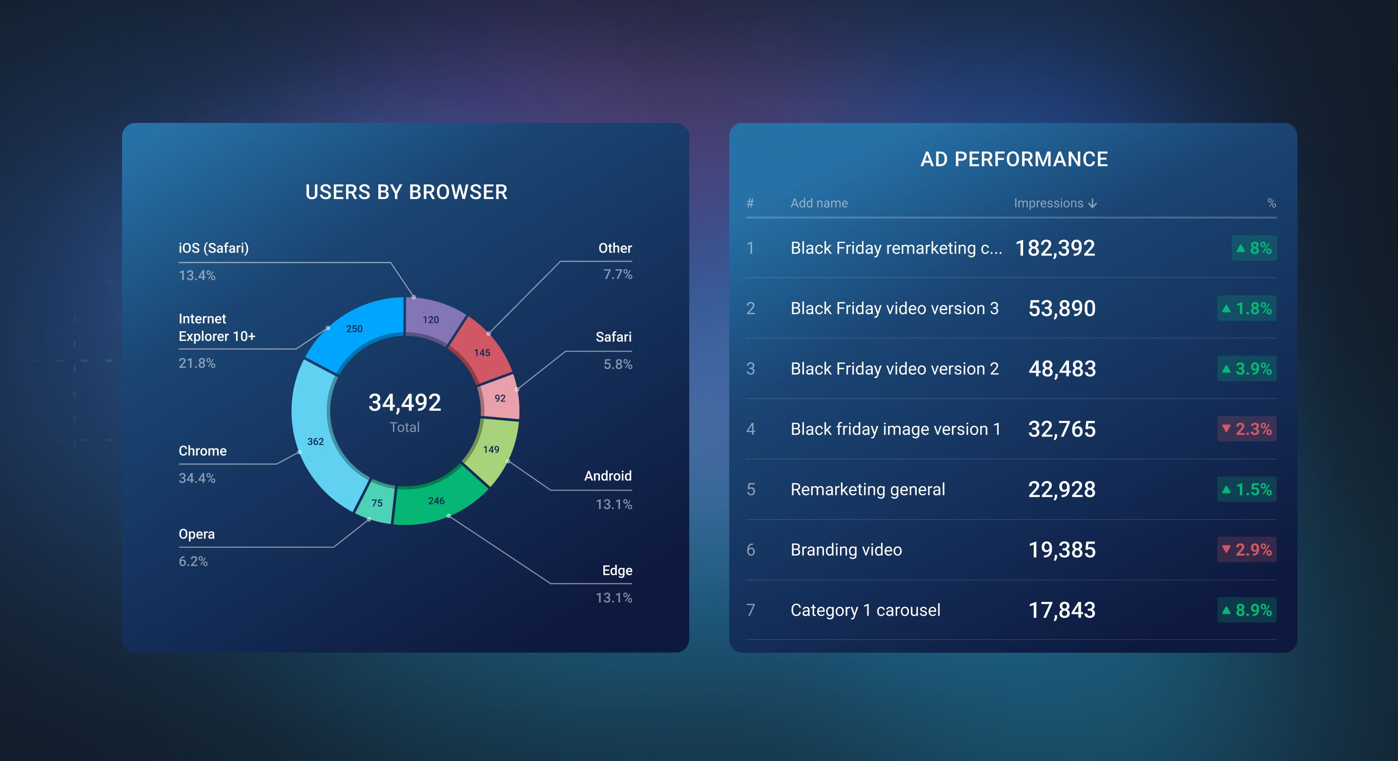
Pie Charts and Tables are both extremely valuable and popular visualizations, but they have different strengths.
Pie Charts great for showing the distribution of data. This may be the distribution of individual Dimensions, like when the Metric "Sessions by Source" is added to a Pie Chart and each "Source" is a different slice of the Pie Chart. On the other hand, a Pie Chart may be populated by individual Metrics. An example of this is adding "Total Followers" Metrics from each Social Source (Facebook, Twitter, LinkedIn, etc.) to a Pie Chart in order to produce a Pie Chart that clearly displays "Total Social Following."
Tables, on the other hand, show exact values and comparison percentages (performance trends). Tables allow you to view comparison percentages and individual Metric or Dimension values are visible without hovering over it. For Pie Charts, you can view the comparison percentages on the tool tips of each slice.
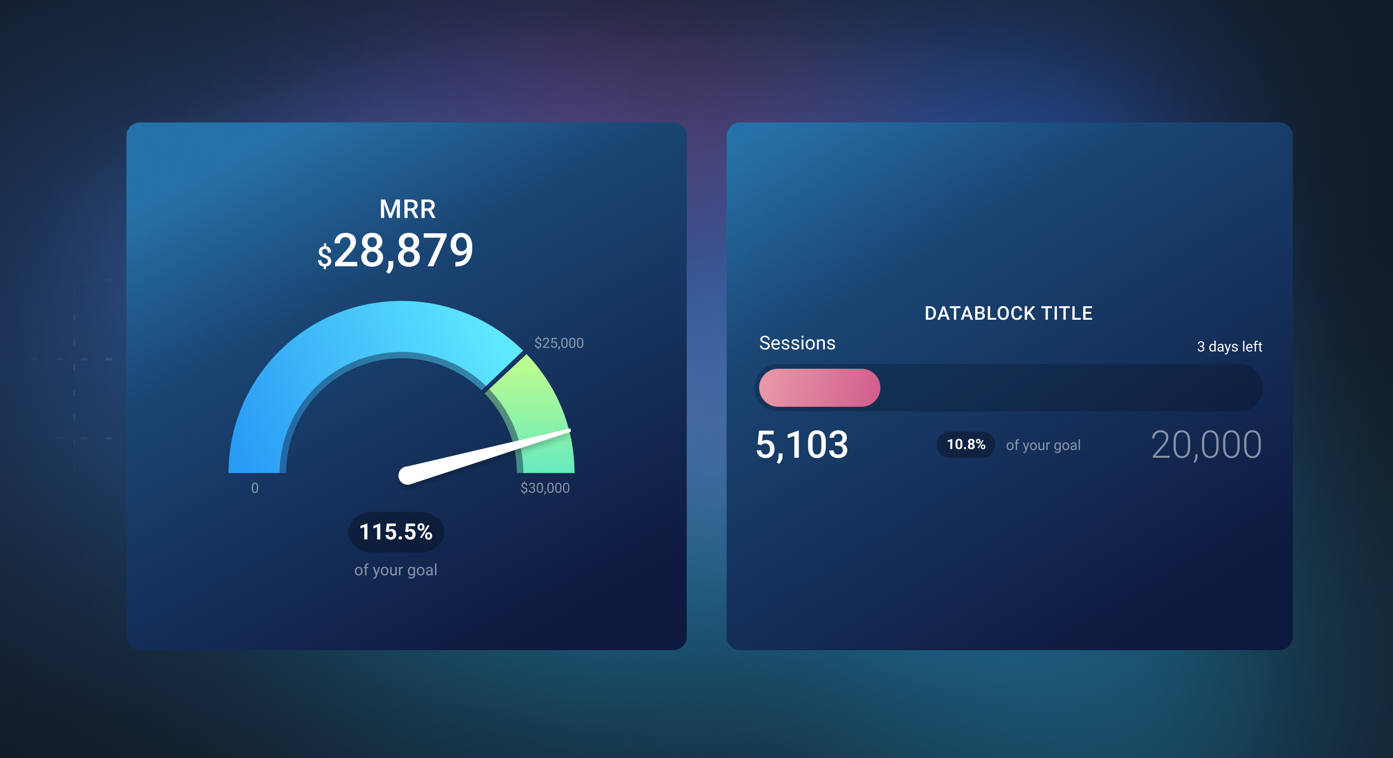
Both of these Visualization Types are relatively straightforward and are great for showing progress towards reaching a goal.
The main difference between the two is that a Metric visualized on a Progress Bar requires a Goal to be added and displayed for each Date Range. Since all Date Ranges don't support Goals, all Date Ranges aren't recommended when using the Progress Bar. Learn more here.
Gauges, on the other hand, allow a "Max Value" to be set. This can be an automated value that's always higher than the Goal, a manually entered maximum, or another Metric as the max. Because of this field, the Gauge is more robust than the Progress Bar.
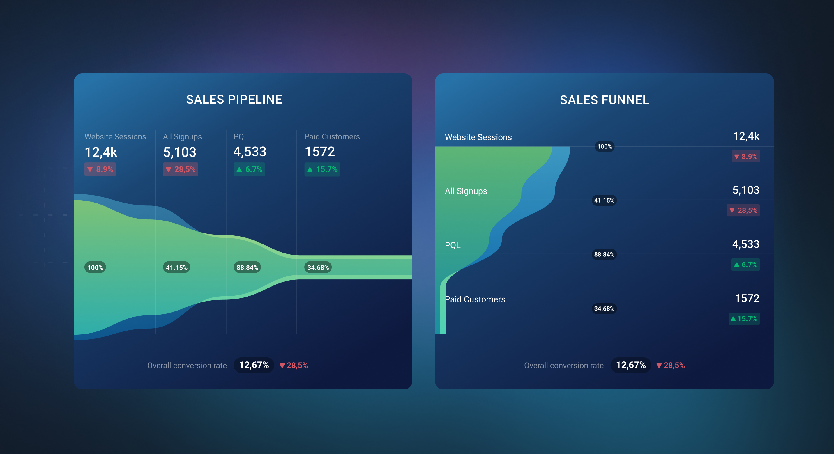
Both Visualization Types are meant to show status or progression of a Contact or Deal.
Visually, a major difference between these two Visualization Types is that a Funnel displays data vertically while a Pipeline displays data horizontally. Both the Funnel and Pipeline have a limit of 10 “rows” that can be added and mapped uniquely.
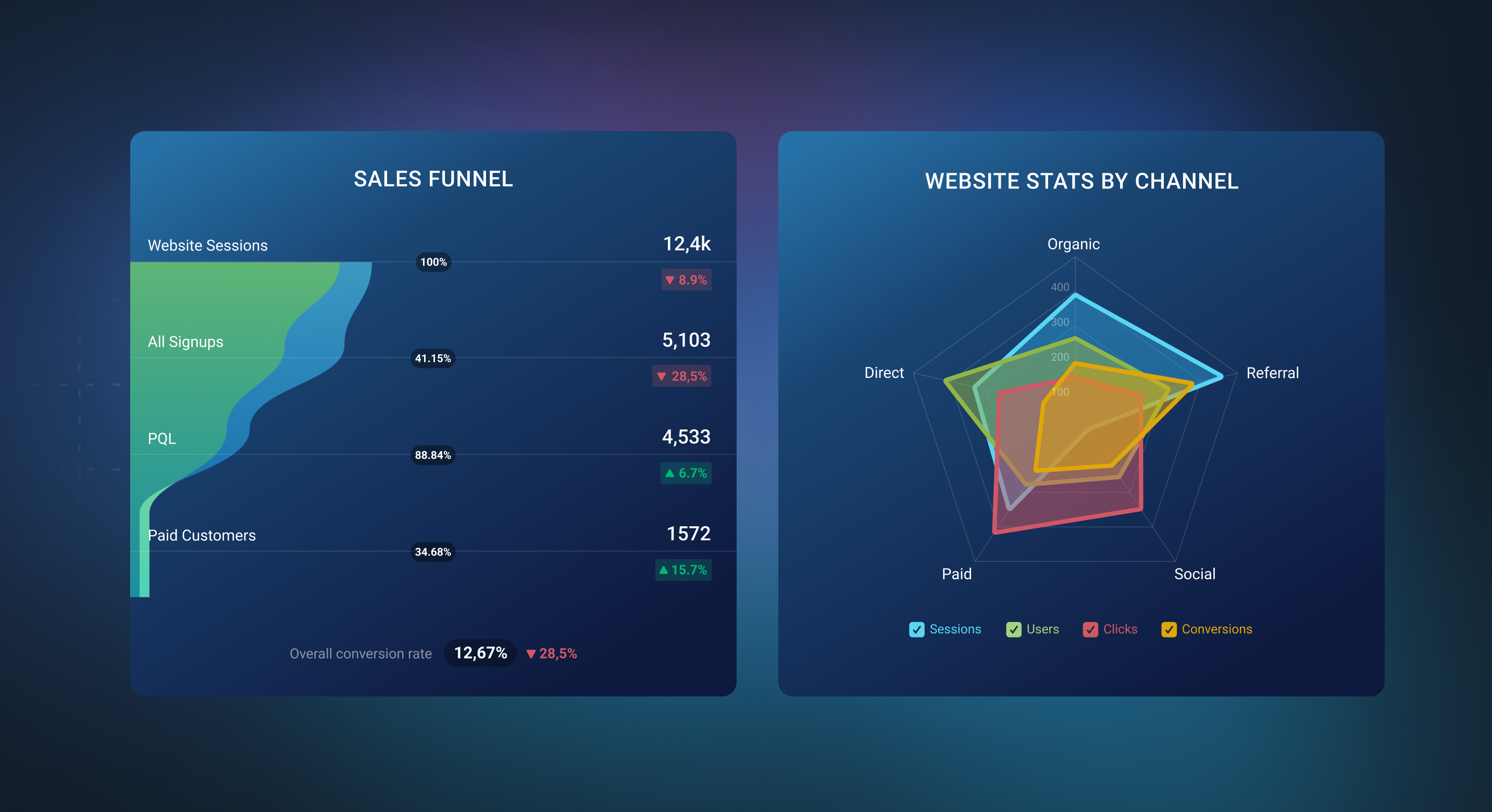
Pipeline/Funnel charts are good for showing progression through certain steps, while a Spider chart is good for comparing progression through those steps for different dimensions. Pipelines can be used to see overall impressions to conversion progression (impressions →clicks→add to cart→conversion), while Spider charts can be used to compare different channels for every metric in the same progression (Google Ads, Facebook ads, search, etc.).
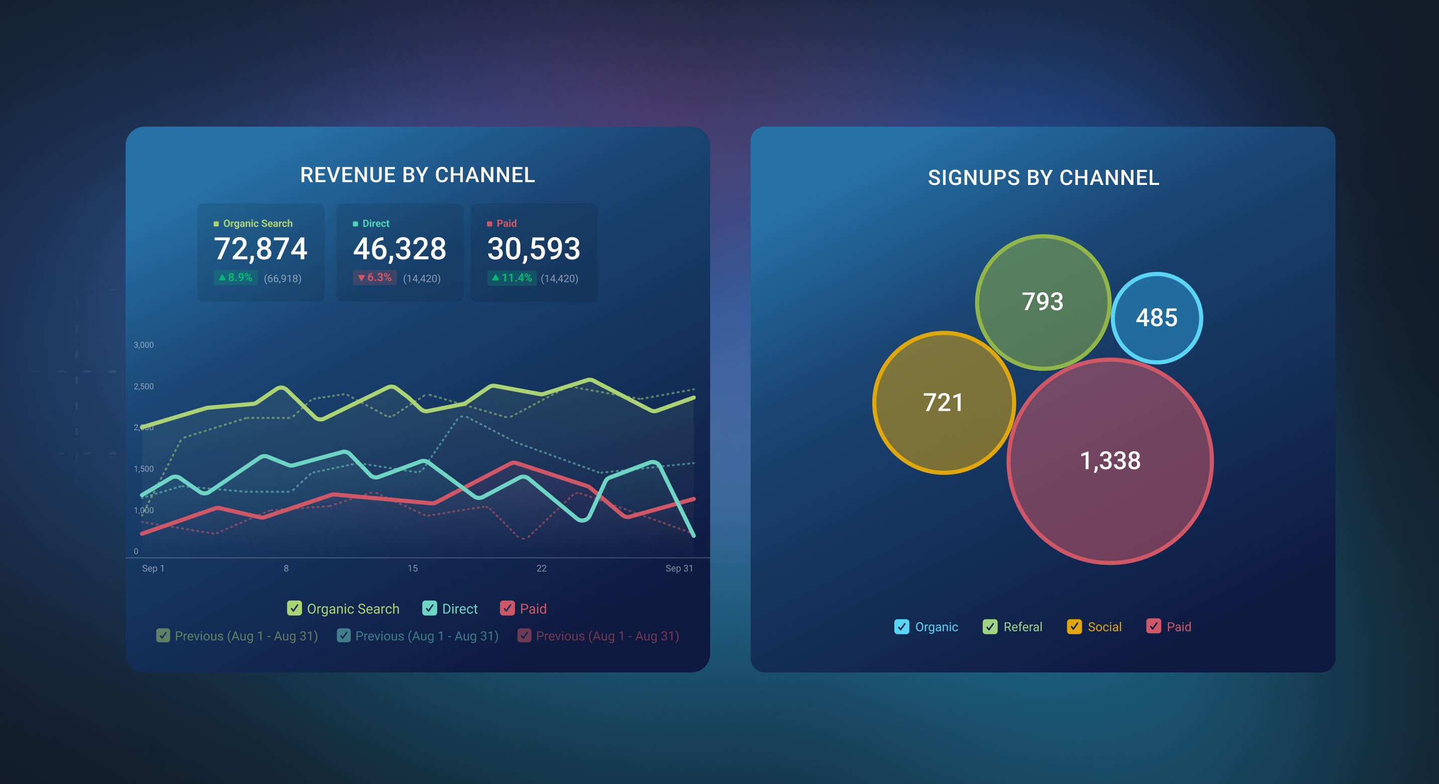
Line Charts are ideal for visualizing data trends over time or across a continuous scale. They use a series of points connected by lines, making it easy to see how a single metric or multiple metrics change over a specified period. Line Charts are effective for illustrating gradual changes and identifying patterns or fluctuations in data.
In contrast, Bubble Charts are used to display individual data points, where the size of the bubble represents the metric's value in a specific period. Bubble Charts are useful for showing a comparison between the metrics, especially when you want to visually represent the difference in values and the change over time is not that relevant.
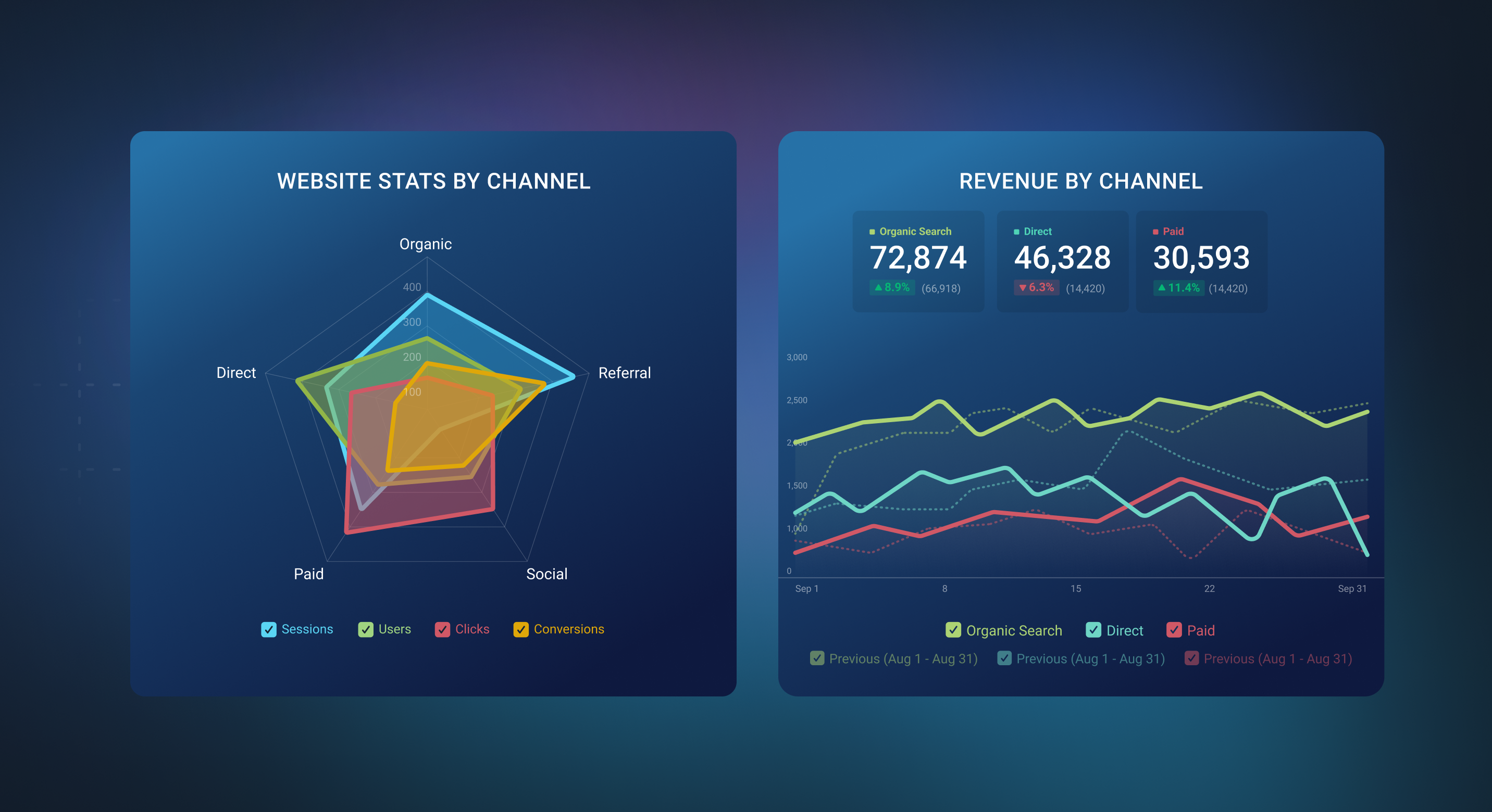
Spider Charts, also known as Radar Charts, are unique visualizations used for comparing data across multiple dimensions or metrics. Spider Charts are particularly useful when you want to compare how various dimensions perform relative to each other, making them suitable for multidimensional analysis.
On the other hand, Line Charts are effective for showing trends and patterns in data over time or along a continuous scale. They use lines to connect data points, allowing you to visualize changes in a single metric or multiple metrics over a specified period. Line Charts are straightforward and familiar, making them suitable for illustrating temporal changes and comparisons within one or two dimensions.
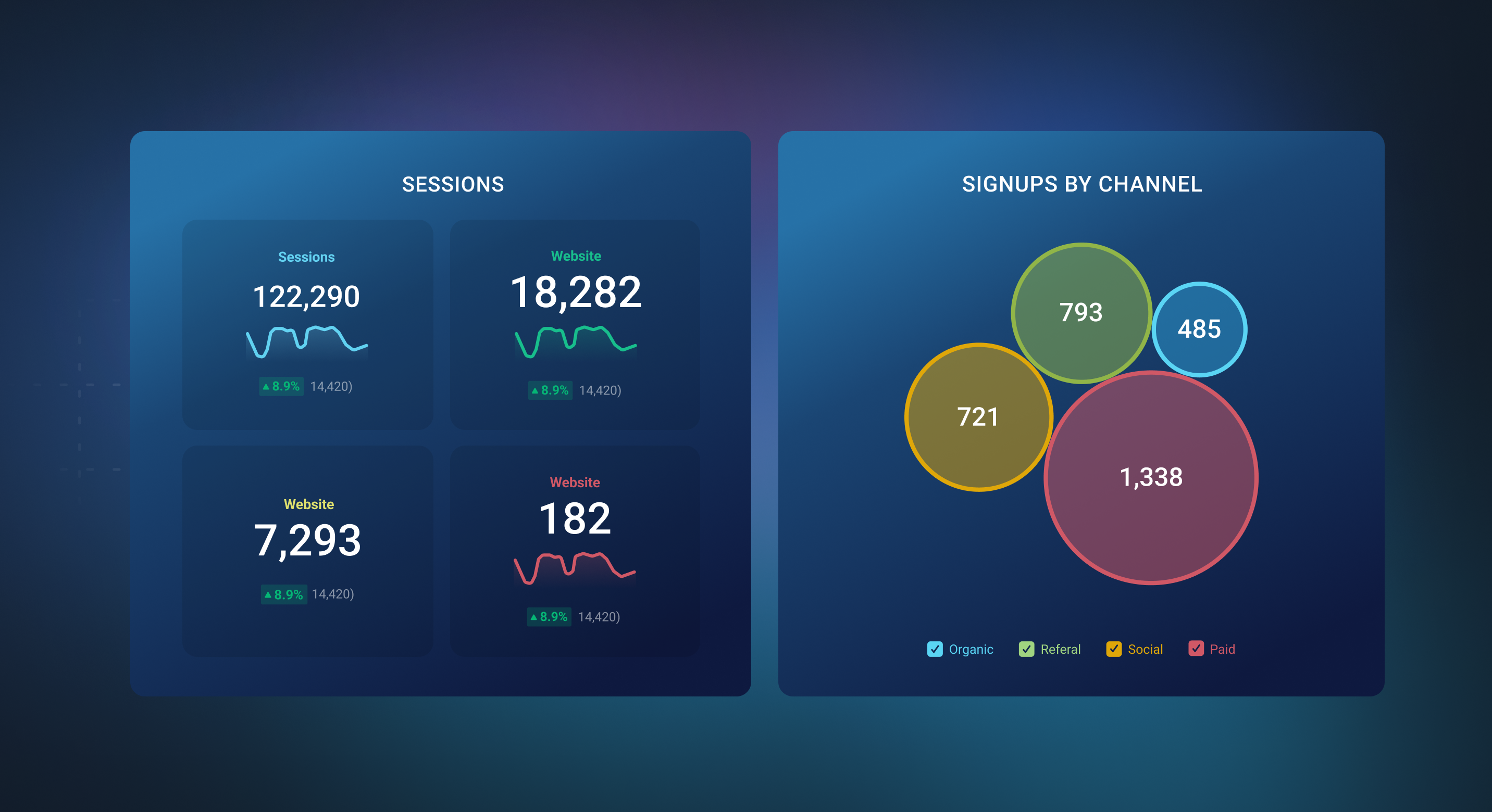
A Number block is a simple and concise way to display single data points. It showcases a single metric or dimension value in a compact format. Number Charts are clear and precise, making them ideal for presenting individual data points without the need for additional context.
A Bubble Chart, in contrast, is a visualization that represents data points as bubbles with varying sizes. It's designed for displaying comparisons between metrics, making it suitable when you want to visualize how metrics differ from each other. Bubble Charts are not intended for displaying a single data point but rather for a visual representation of multiple data points of different metrics or dimensions.
Your Databoard should be named based on common themes surrounding the data on it. Are the Metrics all tracking Website Traffic? Do they report on your Sales activities? This is an area for you to take what you see and name the Databoard accordingly. Some common words used in Databoard names are “Overview” (i.e., "Traffic Overview") and “Performance” (i.e., "Sales Performance").
In the majority of cases, the name of the Datablock should be the same as the name of the Metric. For example, if a Line Chart is showing Sessions, the Datablock title should be “Sessions” (not Traffic). There are two exceptions for this:
If the recipient of the Databoard specified otherwise*.*
You may get a request saying “I want to show Traffic from Google Analytics.” As long as you are certain which Metric they're referring to when they say “Traffic” (i.e., "Sessions" vs "Users"), you can name the Datablock “Traffic” instead of Sessions to produce a better experience for the recipient of the Databoard. If you're not sure what they mean by “Traffic,” it's recommended that you keep the Datablock title the same as the Metric name (“Sessions”) to avoid any confusion.
If the Datablock has multiple metrics displayed on it.
There are cases where it's not as straightforward as the example above, like a Table that shows "Impressions by Campaign," "Keywords by Campaign," "Reach by Campaign," and "Clicks by Campaign." In a case like this, you'll want to find the commonality between the Metrics and name the Datablock accordingly. For this example, we could name the Datablock “Campaign Overview” or “Campaign Performance."
Similar to the Datablock title naming convention, all Column titles should be named after the Metric itself. However, you may choose to shorten the name. This can help ensure the Column title is visible, while also helping with spacing on the Datablock.
For example, if you have a Table that shows "Impressions by Campaign," "Kewords by Campaign," "Reach by Campaign," and "Clicks by Campaign," you can name the columns "Impressions," "Keywords," "Reach," and "Clicks" in an effort to be clear and concise. In this example, the Datablock title should be “Campaign Overview” or “Campaign Performance” to make it clear that you are viewing Campaign Metrics.
In the Designer you have the ability to set the Date Range that the Datablock first loads to. Additional Date Ranges are available while viewing the Databoard.
It's recommended that all Datablocks on your Databoard have the same Date Range selected (whenever possible). This will make the Databoard easier to analyze when it first loads, and will ensure you have the most important information readily available.
- How many different Visualization Types are used on your Databoard?
- We recommend including a variety of Visualization Types on your Databoards. As a general rule, aim for a minimum of 3 different visualizations.
- Do all Datablocks have the same Date Range set?
- If not, check the setup of each Datablock individually.
- Is your Databoard optimized for Mobile use?
- To optimize for Mobile, your most important Datablocks should be at the top in the Mobile view.
- Does the size and spacing of Datablocks on the Databoard follow these general guidelines?
- The only Visualization Type that should be 1x1 is a Number Block
- Charts and Tables should be no less than 2x2
- If there is extra space on the Databoard, include a Text block to add context and tell the story of your data