
The Datablock Editor allows you to customize each Datablock to meet your specific data needs.
The options available in the Datablock Editor differ depending on the visualization selected, so we encourage you to test the functionality yourself to learn what you can do with different visualizations.
Pro Tip: Learn more about the capabilities of the different visualizations available in Databox here.
Below, we will walk through the Datablock Editor for a Line Chart.
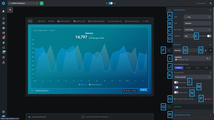
- A) Visualization Type: Select the Visualization type from the drop-down list. Learn more about Visualization types here.
- B) Datablock Title: Enter a name for the Datablock. This will appear at the top of the Datablock on the Databoard and should be a good indicator of what the Datablock is showing.
Pro Tip: Typically, the Datablock Title is named the same as the Metric that you select for the Datablock.
- C) Date Range: Select the Date Range the Datablock will first load to. This should be the most significant Date Range for the Metric. It is recommended that you set a consistent Date Range for all Datablocks on the Databoard.
Pro Tip: You will be able to select additional Date Ranges while viewing your Databoard.
- D) Graph by: For graph visualizations, you will be prompted to select the granularity that you'd like to view your data. "Graph by: Day" will plot daily data on the chart, "Graph by: Month" will plot monthly data on the chart, etc.
- The options available are based on the data availability for the selected Metric.
- E) Cumulative: Use the toggle to determine whether the Chart will display a cumulative graph.
- For certain Metrics and Date Ranges, the Cumulative option may be disabled because it would necessitate adding together unique values and would produce inaccurate data.
- F) Line and Bar Visualization switcher: Select if you want to display your Metric as a Line or a Bar on the chart.
- G) Metric Title: Enter a name for the Metric.
- H) Metric Color: Select a color for your Metric from the drop-down list. You can select a different color for each Metric to help understand your data better.
- I) Metric: Select the Metric that you want to populate the Datablock from the Metric drop-down. You can filter out metrics for a specific Data Source using the Data Source drop-down. Click on the Metric types drop-down to switch between Favorite, Popular, Basic, Custom, and Calculated Metrics.
- J) Additional Lines: Choose whether you want any additional lines added to your Datablock, like the "Compare" line, "Goal" line, "Average" line, "Median" line or "Trend" line. These add context to the Datablock and helps you analyze your performance.
- K) Comparison Value: Select the Comparison Value for your Datablock. This determines what data my current performance will be compared against. Depending on the selection, either the comparison percentage or the percentage to Goal will be displayed at the top of the Databock. You can select multiple comparison periods to see how current performance compares to past trends.
- L) Stack Line: Select this to display stacked lines.
- M) Show Total: Select this to display the total metric value on the top of the chart.
- N) Show Values: Select this to display the values on the chart based on the selected granularity.
- O) Advanced Metric Setting: In the Advanced Metric Settings window you can change the Format, Scale, etc. for this specific Metric. Learn more about Advanced Metric Settings here.
- P) Delete: Click on this to delete your Metric.
- Q) Add Metric: Click on this to add another Metric to your Datablock.
Pro-Tip: You can display up to 15 Lines, which means that 15 Metrics or Dimensions can be displayed on your Line Graph.
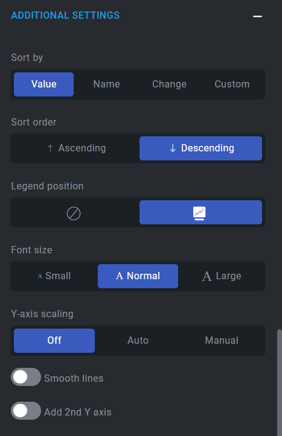
- R) Additional Settings: In the Additional Settings window, you can change the Scaling, Font Size, Legend position etc. of your Metrics. Each setting is defined below:
-
- Sort by: Select the way to arrange your Metrics on the chart. You can sort them by value, name, change or in a custom order.
- Sort by Value: Sort by Value to display either the highest or lowest values first.
- Sort by Name: Sort by Name to sort the Metrics in alphabetical order.
- Sort by Change: Sort by Change to sort the Metrics based on the percent change value.
- Sort by Custom: Sort by Custom to drag and drop the Metric in your preferred custom order.
- Sort Order: Choose either an "Ascending" or "Descending" sort order to display your Metrics.
- Legend Position: Select if you want to display the legend under your chart or not.
- Font Size: Choose the best font size according to your Databoard. You can choose from small, medium, and large font size.
- Sort by: Select the way to arrange your Metrics on the chart. You can sort them by value, name, change or in a custom order.
-
- Y-Axis Scaling: Auto-scaling updates the y-axis based on the selected Metric value. This can make it easier to analyze your reports if you have very large or small Metric values. By selecting the manual option, you can select the minimum and maximum values you want to display on the y-axis.
- Smooth Lines: Select this to smooth the lines on the chart to help visualize the trends.
- Add 2nd Y axis: Add a custom second y-axis when the difference between Metric values is reasonably large (greater than 3x difference). This allows you to better identify fluctuations between two Metrics.
-